
You spend hours driving visitors to your Shopify storefront, yet your sales dashboard remains stagnant. It is a frustrating reality that many entrepreneurs face when relying on organic traffic without a massive advertising budget. Improving your conversion rate does not require expensive software or complex automated funnels. Instead, you need to refine the user experience to ensure that every visitor understands exactly why they should buy from you today.
How to Refine Your Storefront for Maximum Conversions
Why does site speed impact your bottom line?
Modern shoppers possess very little patience for slow-loading pages. If your product images take more than a few seconds to render, your potential customer will likely bounce to a competitor. I have found that optimizing your media files is the most effective way to improve performance without spending a dime.
You should start by compressing every image before uploading it to your theme. Tools like TinyPNG allow you to reduce file sizes significantly while maintaining visual quality. Smaller files lead to faster load times, which directly correlates with higher engagement.
Beyond image size, consider the impact of heavy apps on your store speed. Every app you install adds code that your customer’s browser must process before the page appears. Audit your installed applications regularly and remove any that do not provide immediate value to the customer journey.
A fast site builds trust, and trust is the precursor to a transaction. When your store loads instantly, it signals professionalism and reliability to the visitor. That initial impression is often the difference between a bounce and a completed checkout.
How can you simplify your store navigation?
A cluttered menu is a silent killer of sales. If a user cannot find the specific category or product they want within seconds, they will leave your site. I always advise keeping your primary navigation limited to five or six essential links.
Use descriptive labels for your menu items rather than creative or abstract terms. If you sell apparel, use “Menswear” instead of “The Collection.” Clarity helps the user map their journey through your store with minimal cognitive effort.
You should also implement a robust search bar that displays predictive results as the user types. This feature helps customers find exactly what they need without navigating through multiple pages. A seamless path to the product is essential for maintaining momentum.
Finally, ensure your mobile navigation is intuitive for touchscreens. Test your store on your own smartphone to identify any buttons that are too small or menus that are difficult to expand. A friction-free mobile experience is non-negotiable in today’s mobile-first market.
Optimizing Product Pages to Drive Action
How do you write compelling product descriptions?
Most store owners treat descriptions as mere technical specifications, which is a missed opportunity. You must shift your focus toward the benefits rather than just the features of your items. Tell your customer how their life improves because they own your product.

Use short sentences and bullet points to break up large blocks of text. Most people scan rather than read deeply when they are shopping online. Bold the most important advantages to capture the attention of these busy scrollers immediately.
I recommend addressing common objections directly within the product description. If you are selling a kitchen tool, mention how easy it is to clean or store. By answering questions before they are asked, you remove the hesitation that stops a purchase.
Your writing should reflect the voice of your brand while remaining professional. A consistent tone helps build a connection with your audience, making them feel more comfortable buying from you. People purchase from people, not just from faceless digital storefronts.
Why are high-quality visuals essential for conversions?
Since your customers cannot touch or feel the products, your images must do the heavy lifting. Invest time in taking clear, well-lit photos from multiple angles to provide a complete view. You do not need a professional studio, just a smartphone and natural lighting.
Include at least one lifestyle image that shows the product in use. This helps the customer visualize themselves owning the item and makes it feel real. Contextual imagery bridges the gap between a digital file and a physical possession.
Video content is another powerful tool that costs nothing but your time. A short clip showing the product’s functionality can significantly increase your conversion rate. It provides transparency and proves that the item works exactly as described.
Consider the following table to understand how different visual elements impact the buyer’s decision-making process:
| Visual Element | Primary Purpose | Conversion Benefit |
|---|---|---|
| Product Close-up | Shows texture and quality | Reduces return probability |
| Lifestyle Image | Provides context and usage | Increases emotional connection |
| Short Video | Demonstrates functionality | Builds buyer confidence |
Building Trust Without Spending Money
How can social proof influence new buyers?
New visitors are often skeptical of stores they have not heard of before. You must leverage the experiences of past customers to validate your brand’s legitimacy. Encourage your existing buyers to leave reviews on your product pages.
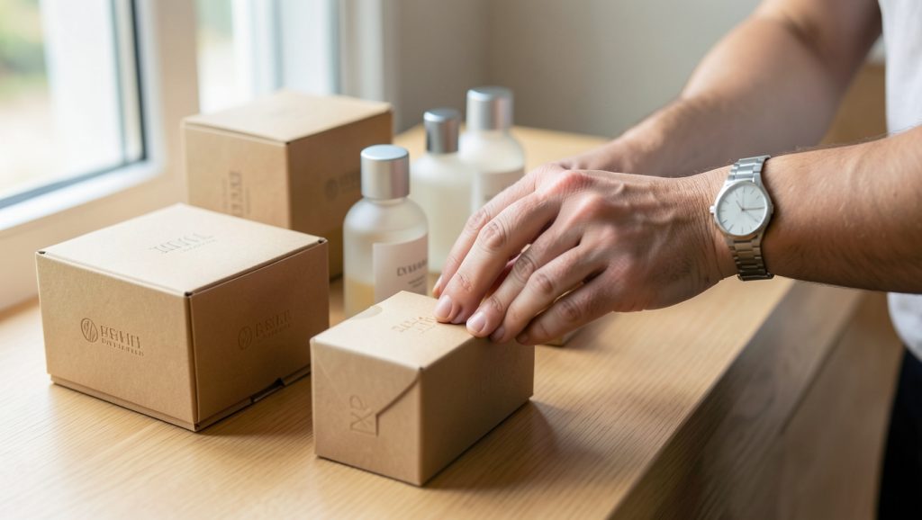
Automate a follow-up email sequence that triggers after a reasonable delivery window. Ask for their honest feedback and provide a clear link to the review section. Social proof acts as a psychological shortcut for new buyers who are on the fence.
Display your best reviews prominently near the “Add to Cart” button. Seeing a five-star rating from someone else provides the social validation necessary to complete the sale. It transforms your store from a risky gamble into a trusted destination.
Be transparent when handling negative feedback. If you receive a critical review, respond professionally and offer a solution. Other shoppers will notice how you handle issues, which can actually increase your credibility more than a perfect rating.
What role does your “About Us” page play?
Your “About Us” page is not a place for a corporate biography; it is a place for your brand story. Explain why you started your store and what values drive your business. This narrative creates an emotional anchor that differentiates you from massive marketplaces.
Share photos of your team or your workspace to humanize the brand. When customers know there is a real person behind the screen, they are more likely to forgive minor delays or mistakes. Authenticity is a competitive advantage that costs nothing to cultivate.
Include your contact information clearly on this page. Having an email address or a physical business location builds significant trust. It shows that you are a legitimate operation that stands behind its products.
Use this page to reiterate your commitment to quality. If you have a specific return policy or a guarantee, highlight it here. Clear policies reduce the perceived risk of shopping with a smaller, independent retailer.
Mastering the Checkout Experience
How can you reduce cart abandonment?
The checkout process is where most sales are lost due to unexpected surprises. If you hide shipping costs until the final step, your customers will abandon their carts. Be upfront about all costs as early as possible in the user journey.
Offer guest checkout options to minimize the barriers to purchase. Forcing a user to create an account creates unnecessary friction that stops many sales. Speed is the priority during the final stage of the funnel.
Consider implementing a progress bar that shows the customer how close they are to completion. This small visual cue keeps the user focused on finishing the task. It is a simple tactic that acknowledges the user’s effort in completing the checkout.
Review your payment options to ensure you support the methods your audience prefers. If you sell to a younger demographic, consider integrating digital wallets. Removing payment friction is one of the fastest ways to see an immediate lift in your conversion rate.
Why should you optimize your email recovery sequence?
Not every visitor will purchase on their first visit, and that is perfectly normal. You must capture their email address so you can bring them back to your store. A simple exit-intent popup offering a small discount or a helpful guide can be very effective.
Once you have their email, send a timely cart abandonment message. This email should remind them exactly what they left behind and why it is a great choice. Keep the tone helpful rather than pushy to maintain a positive relationship.
Include a direct link that returns them to their saved cart with all items intact. The easier you make it for them to finish, the higher your recovery rate will be. I suggest testing different subject lines to see what resonates best with your audience.
You can use free tools like Klaviyo to manage these automated flows efficiently. By nurturing these leads, you turn a lost sale into a recurring customer. Consistent follow-up is the backbone of a sustainable, low-budget growth strategy.
Implementing these changes requires patience and a willingness to test different approaches. Monitor your analytics closely to see which adjustments yield the highest impact on your conversion rate. As you refine your strategy, focus on the persistent goal of making the customer experience as smooth and trustworthy as possible, and the results will naturally follow.
